In my last article I covered Mosaic’s layout system — Section, Container, Grid, Rows, Columns, and Div. A lot of theory, a lot of “here’s how it works in principle.” This article is different. This is a real example.
I opened the Monolith theme library, picked one of the pre-built sections — the Milestone block — and looked at how it’s actually built under the hood. What I found was interesting. Not wrong, but interesting. And it gave me a chance to compare two different approaches to the same layout problem: the Mosaic way, and the CSS Grid way.
Here’s what I learned.
What the Milestone section is
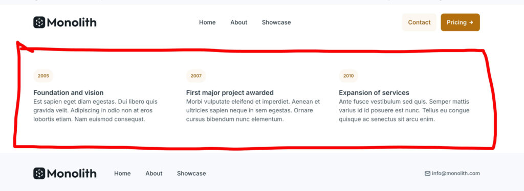
The Milestone section is a three-column block showing company milestones — a year badge, a title, and a paragraph of text per column. Clean, simple, commonly used for timelines, features, or stats.
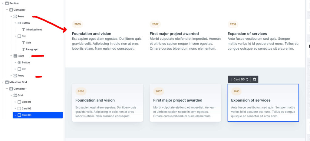
When you import it from the library and open the Navigator, the structure looks like this:
Section
Container
Rows
Button (year badge)
Div
Text
Paragraph
Rows
Button
Div
Rows
Button
Div
Three separate Rows elements, each one containing a year badge and the text content below it. Each Row is managed independently.
This is the Mosaic speed approach — fast to build, easy to understand, works immediately.
The alternative — CSS Grid
When I looked at this structure, my first instinct was to reach for a Grid. Coming from Elementor, a three-column equal layout immediately reads as 1fr 1fr 1fr — let the browser handle the symmetry, manage one element instead of three.
The Grid approach looks like this:
Section
Container
Grid (3 columns: 1fr 1fr 1fr)
Card 01
Card 02
Card 03
One parent Grid, three child cards. The browser distributes them equally. If you add a fourth card later, the Grid handles it automatically.
This is not the Mosaic way — it’s the CSS Grid way. And both are valid. The difference is what you’re optimising for.
The Rows approach is faster to set up and easier to edit individually. The Grid approach is cleaner structurally, easier to maintain at scale, and more predictable when content length varies between columns.
For a site where I’m building a design system from scratch — which is exactly what buildwithmosaic.com is — the Grid approach makes more sense.
A note on philosophy: this isn’t criticism of how Mosaic builds their templates. Their method is optimised for speed and ease. The Grid method is optimised for system-wide scalability. Both are valid — understanding why you choose one over the other is what makes you a better builder.
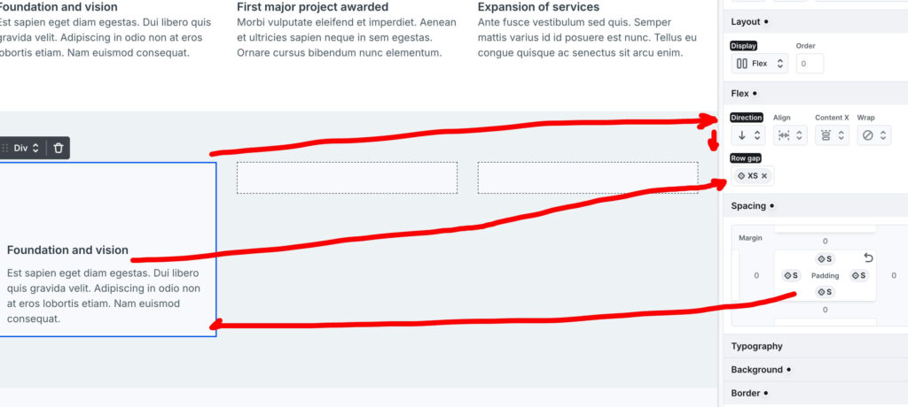
Step 1 — The parent Grid
Instead of three independent Rows, start with a single Grid element set to three equal columns: 1fr 1fr 1fr.
This is the skeleton — one element that defines the entire layout. The browser handles the column widths, the gaps, and the symmetry. You manage one element instead of three.
Set the column gap to the L Style Variable. Not a hardcoded pixel value — a variable. If you ever update your site’s spacing system, this section updates automatically.
Step 2 — Spacing with variables
This is worth pausing on because it’s one of those Mosaic details that seems small but compounds over time.
Instead of typing 32px for the grid gap and 16px for the card padding, use Style Variables — L for the gap, S for the card padding. The values stay consistent across the site. If you decide your spacing scale needs to shift, you change the variable once and every element using it updates.
In Elementor I was hardcoding pixel values per element for years. This is better.
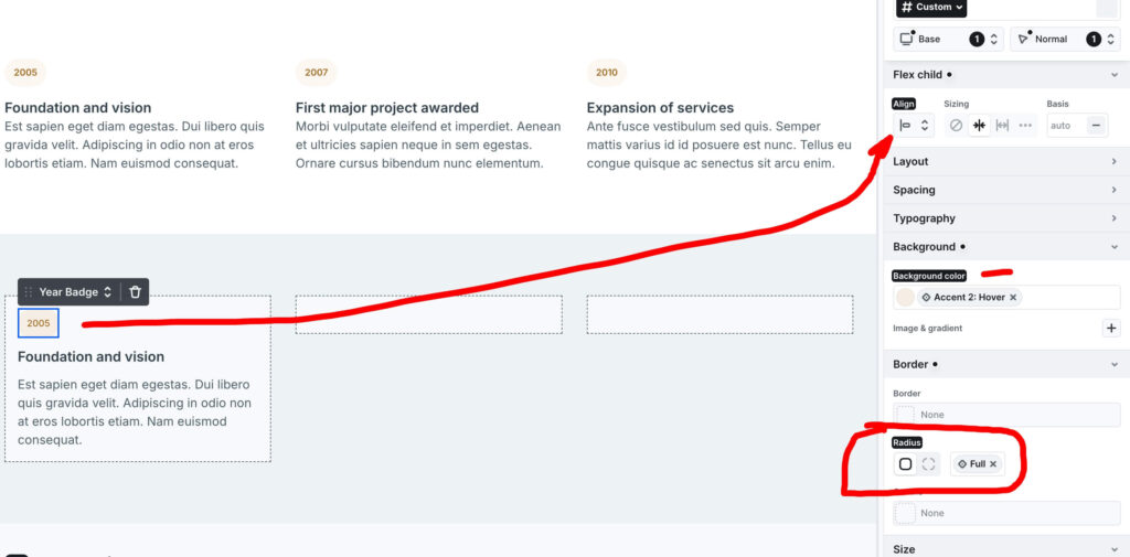
Step 3 — The stretching badge problem
Each card contains a year badge and text content below it. The card itself is a Flex Column — which means child elements stretch to fill the full width by default.
The year badge is small — it should only be as wide as its text. But Flexbox wants to stretch it across the entire card width.
The fix is Align-Self: Start on the badge element. This tells the badge to ignore the parent’s stretch instruction and size itself to its content only. No forced width, no magic numbers — just the correct Flexbox property applied to the right element.
This is the kind of thing Elementor handled invisibly. In Mosaic you make the decision consciously. Once you know about Align-Self, you’ll use it constantly.
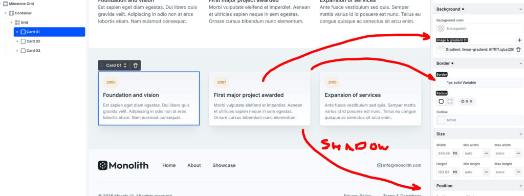
Step 4 — Design depth
Three layers of polish that take the cards from functional to premium:
- Linear gradient background — a subtle gradient on each card mimics natural light and gives the surface a physical quality. Not dramatic, just enough to lift it off the page.
- Variable border — a 1px solid border tied to a theme variable. Consistent with every other bordered element on the site, and updates automatically if you change the variable.
- Box shadow — creates elevation. The card feels like it’s sitting above the background rather than printed onto it. Again, tied to a variable rather than a hardcoded value.
Three properties, all using Style Variables. The card looks designed, not just built.
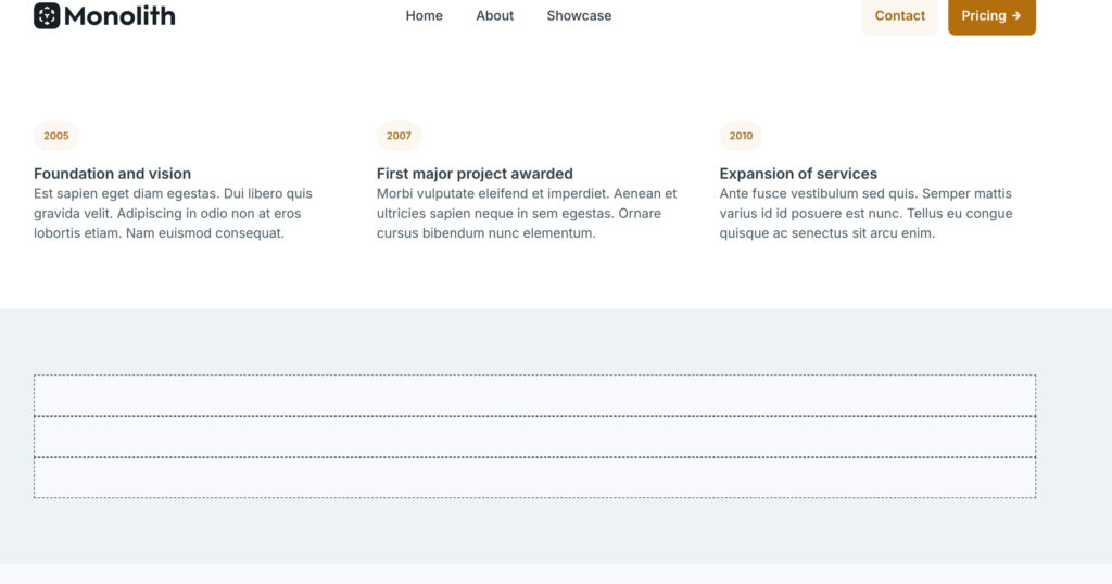
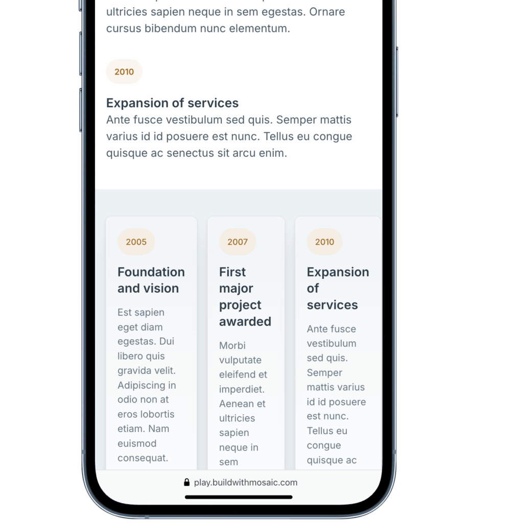
Step 5 — Responsive behavior
Desktop is three equal columns. But on smaller screens, three columns gets cramped fast.
Almost every WordPress developer has sent a client a draft, the client opens it on their phone, and suddenly three columns are squeezed into 320px with unreadable text. Check mobile early — before you change a single color or font.
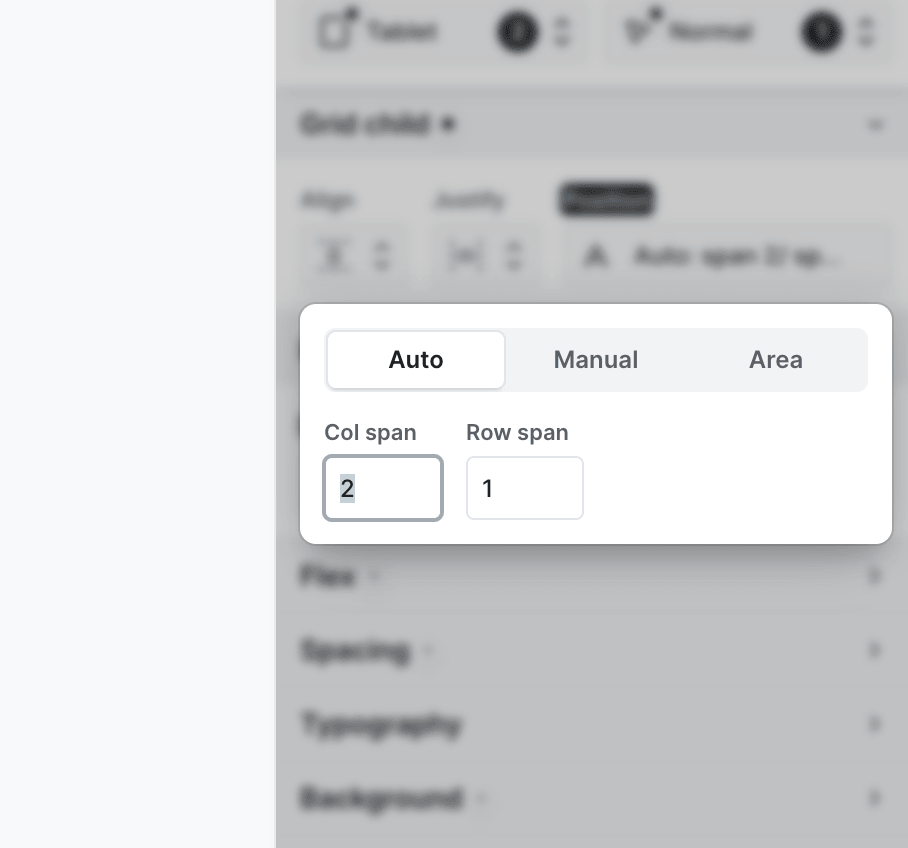
Tablet — the 2+1 layout
On tablet, switch the Grid to two columns (1fr 1fr) and set the third card to Col Span: 2. This makes the third card span across both columns — a balanced, modern layout that uses the available space properly instead of squeezing three columns into a tablet viewport.
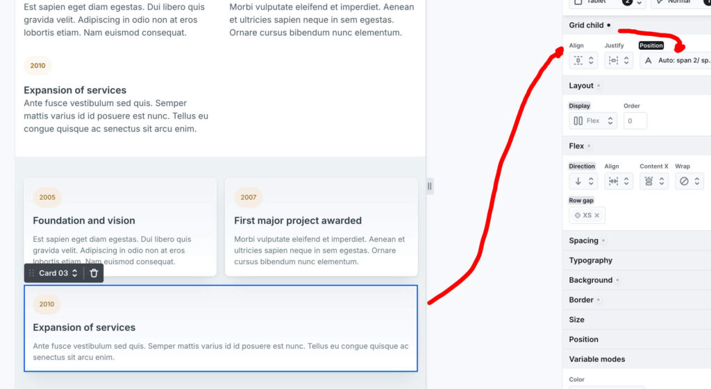
This is a Grid feature that Rows simply can’t replicate. With three independent Rows you’d have to restructure the entire layout for tablet. With a parent Grid, it’s two settings on one element.
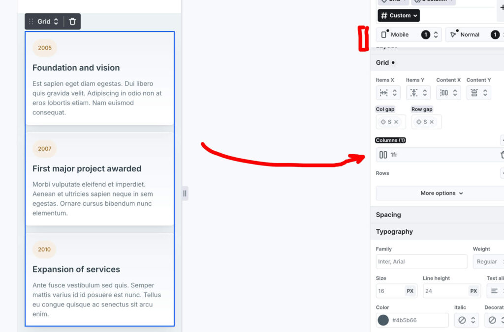
Mobile — single column
On mobile, collapse the Grid to a single 1fr column. All three cards stack vertically. Because the gap is tied to the S variable — which is already appropriately sized for vertical spacing — no extra adjustments are needed. The spacing just works.
The honest takeaway
The official Mosaic Rows approach isn’t wrong. It’s fast, readable, and perfectly valid for a section you build once and don’t touch again.
But if you’re building a design system — consistent spacing, scalable structure, responsive behavior that doesn’t require rebuilding — the Grid approach is worth the extra minute of setup.
The real lesson isn’t “Rows bad, Grid good.” It’s that understanding both options lets you choose deliberately. That’s what separates someone who uses a page builder from someone who understands what’s happening underneath it.
What to look for next time
Next time you import a block from the Mosaic Library, do this before you touch anything:
Open the Navigator. Look at the structure before you look at the design. Ask yourself — is this using Rows or Grid? Why did they make that choice? Could it be improved for your specific project?
Then switch to mobile view. Before you change a single color or font, check how the layout behaves on a small screen. Most layout problems are invisible on desktop and obvious on mobile. Your clients will always check on mobile first.
These two habits — reading the Navigator and checking mobile early — will save you more time than any template ever will.
Next in the series — another pre-built Mosaic component, deconstructed.
I’m building buildwithmosaic.com as a resource for WordPress developers learning Mosaic Builder. If you’re coming from Elementor or JetEngine, follow along — I’m translating everything through that lens.